Capital Services Group
Construction and Facilities, London
Website design, Copywriting, Photography direction, Build
Construction
Sector led routing
Next.js
Four divisions, one company
What was wrong
A firm working on luxury residential, heritage, and government buildings across London, with a website that looked like a local handyman. The gap between the work and the presentation was costing them tenders.
How we read the brand
Four divisions, four different buyers, one company. So the site is organised by who is reading it rather than by what the company does internally, and each division carries its own enquiry route. Deep navy and brass, a Didone display face, and full bleed photography of real London sites give it the weight a procurement team expects.
What it does now
A construction enquiry and a cleaning contract enquiry no longer arrive looking identical. Each division can send a prospect straight to its own page, and the enquiry arrives already labelled with which part of the business it belongs to.
Every screen, as it really renders.
Captured from the live site at full width. Nothing here is a mockup or a flattering crop.
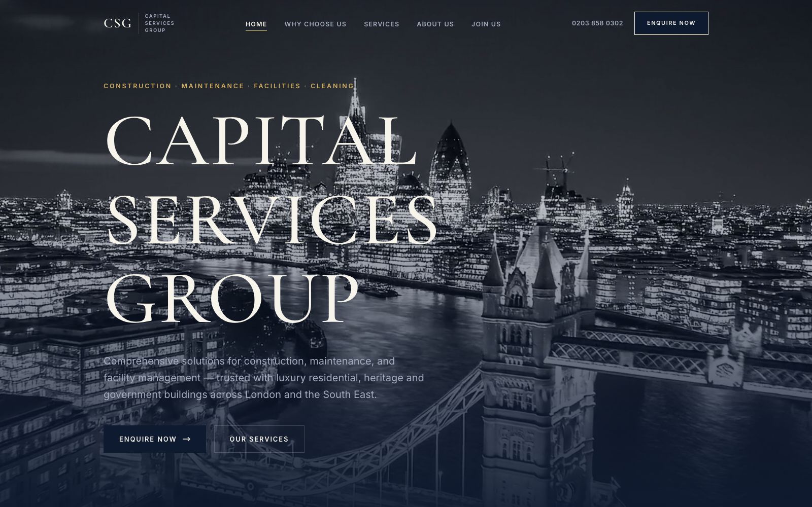
Home
The city at night behind the name. The four divisions are named in the first line so nobody has to guess.
Construction
One of four division pages, each with its own hero, its own proof, and its own enquiry route.

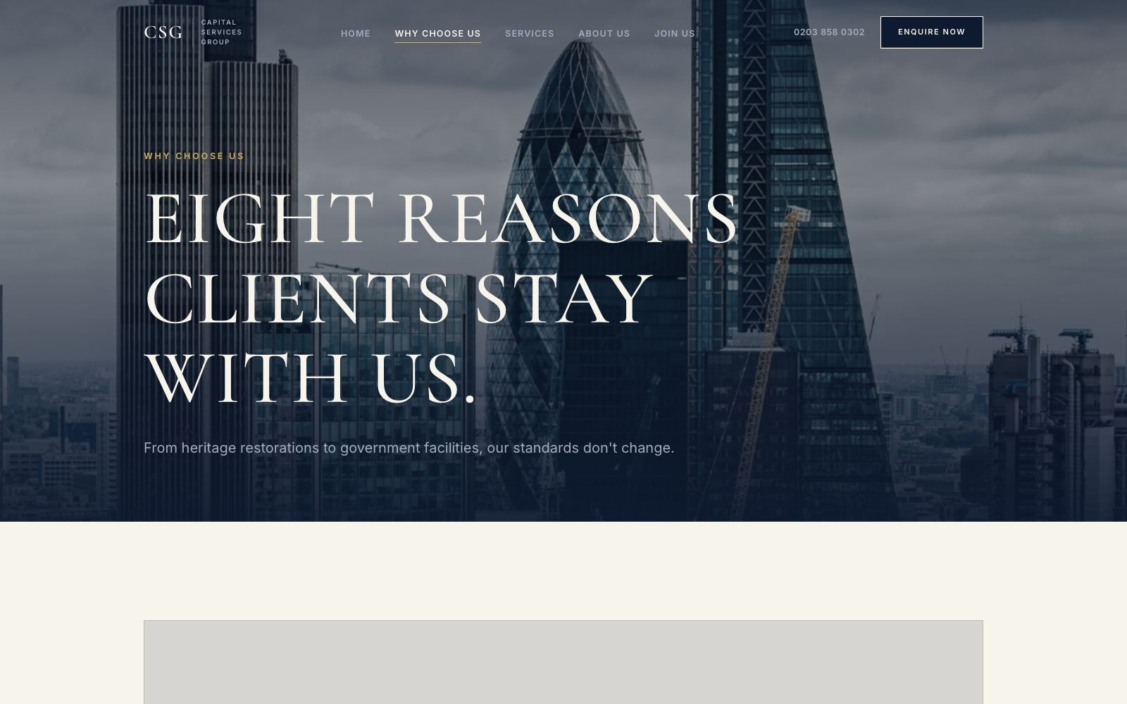
Why choose us
Accreditations, response times, and client types laid out as facts rather than adjectives.
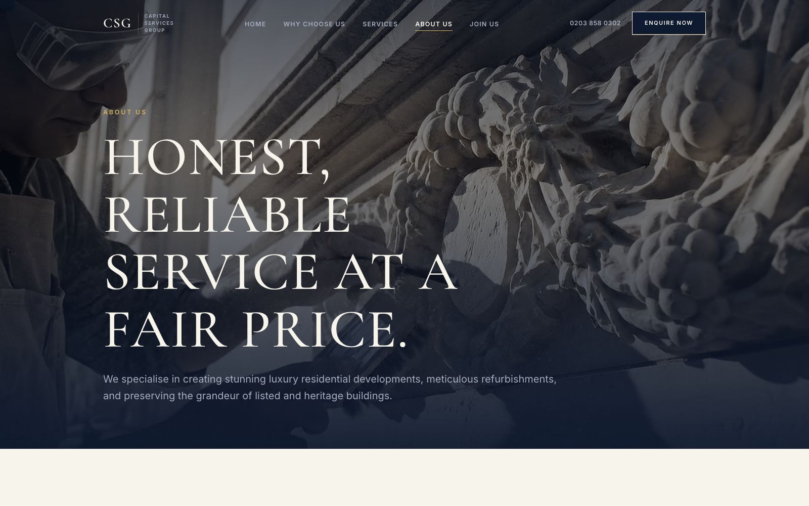
About us
The people and the history, kept short, because in this sector credibility comes from the work above it.
On a phone
Most of the traffic to a site like this arrives on a phone, so the mobile layout is designed first and the desktop version follows it.

The same site at 430 pixels wide. Type resizes rather than shrinks, the navigation collapses into something you can reach with a thumb, and every image is served at a size that will actually load on mobile data.