House Kitchen & Bar
Kalamar Bay, Kalkan
Website design, Art direction, Copywriting, Build
Hospitality
Five
Static, hand coded
The bay as the hero
What was wrong
A restaurant on a terrace above a bay in southern Türkiye, discoverable only through a Google Business listing and a handful of TripAdvisor photographs.
How we read the brand
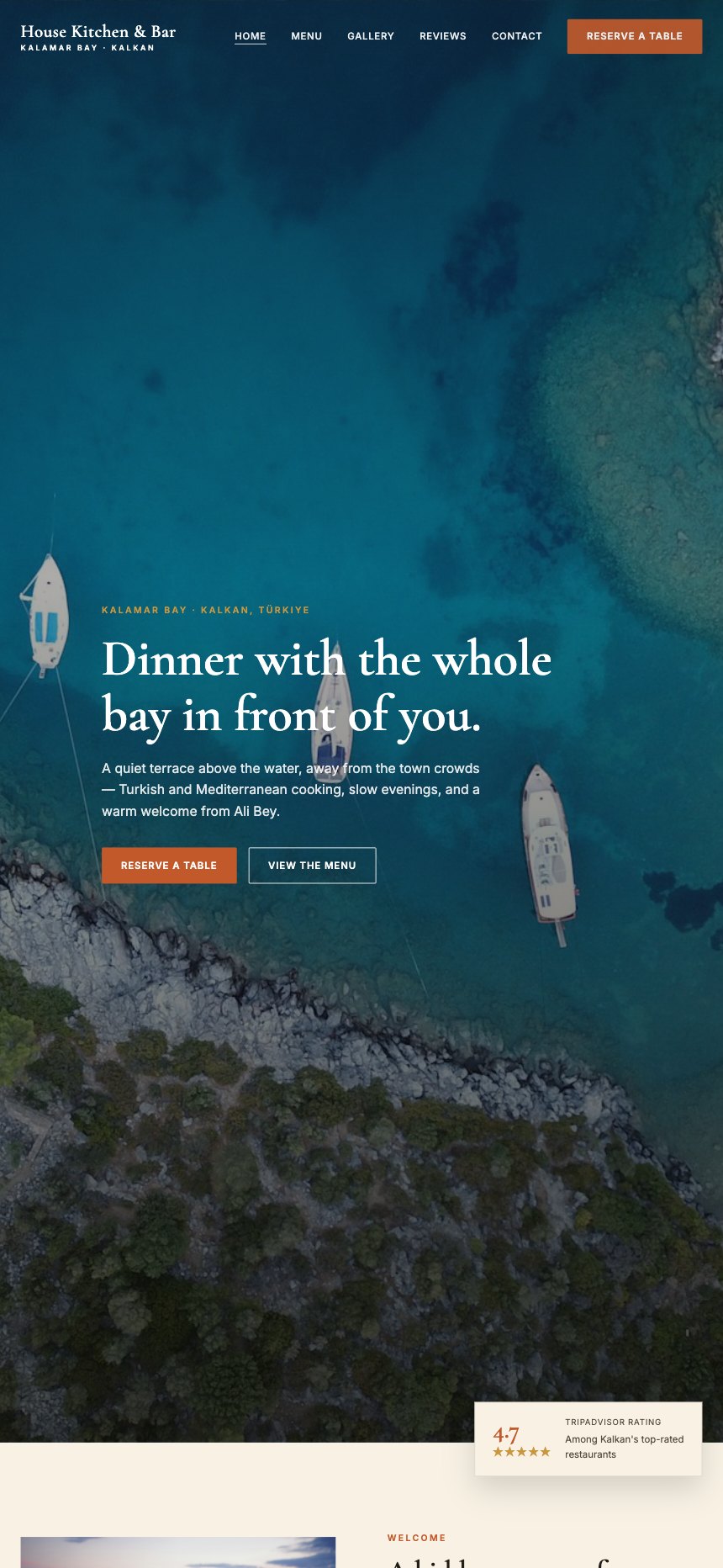
The single strongest asset was the view, so the site opens on an aerial of the bay with the boats in it and one line of copy over the top. Everything after that is restrained on purpose: a warm serif, terracotta pulled from the roof tiles, and a lot of paper. Holiday restaurants usually over decorate, and it makes them look cheaper than they are.
What it does now
A site that sells the evening rather than the menu, with the reviews and the reservation both one click from the first screen.
Every screen, as it really renders.
Captured from the live site at full width. Nothing here is a mockup or a flattering crop.
Home
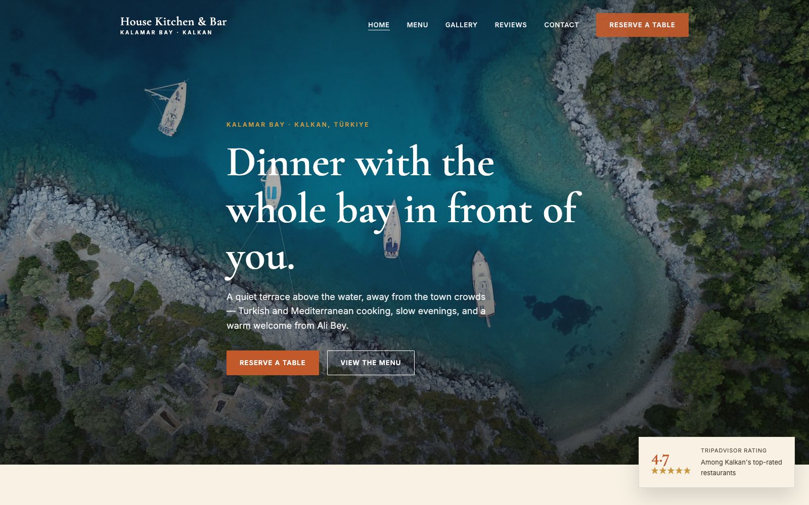
One aerial photograph, one sentence, two buttons. The bay is the argument.
Menu
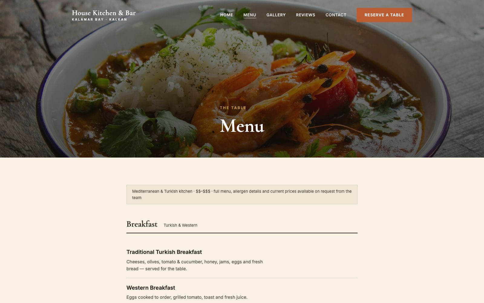
The real menu as a readable page, sectioned and priced, not a photograph of a laminated card.
Gallery
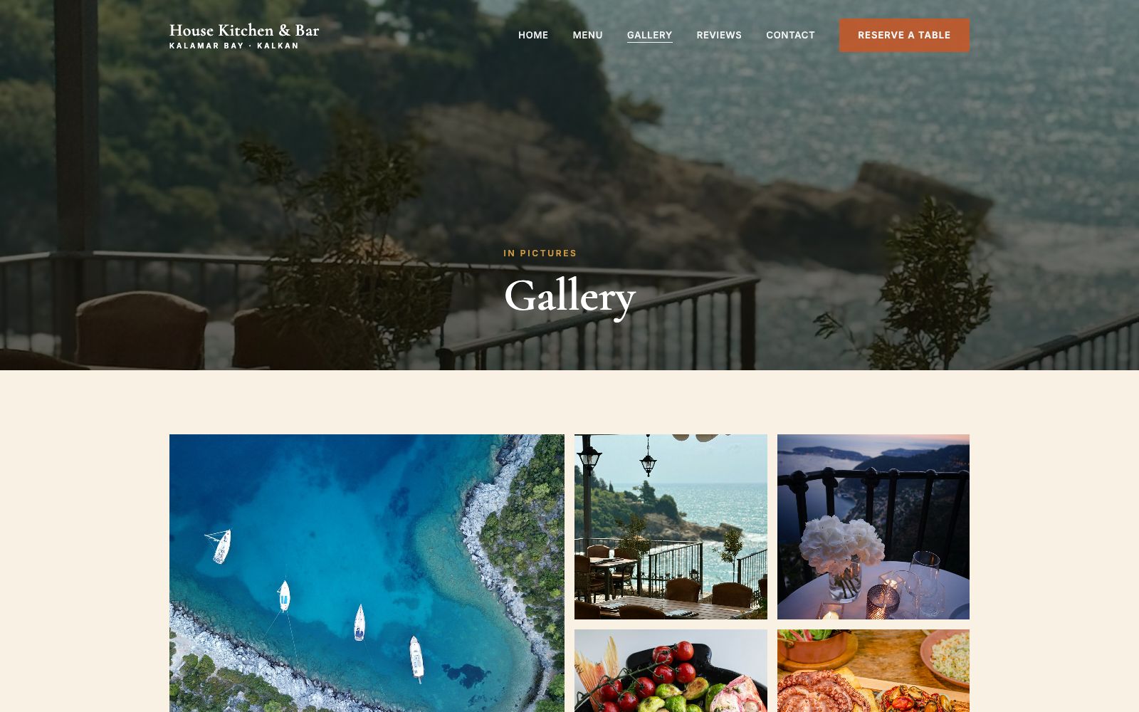
The terrace at different times of day, because the light at eight is the actual product.
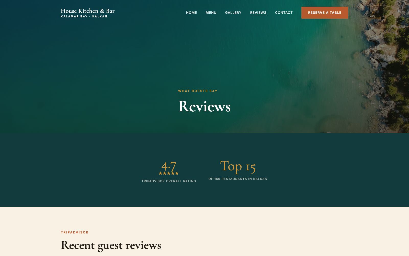
Reviews
Real guest reviews pulled through rather than summarised, with the rating stated plainly.
On a phone
Most of the traffic to a site like this arrives on a phone, so the mobile layout is designed first and the desktop version follows it.
The same site at 430 pixels wide. Type resizes rather than shrinks, the navigation collapses into something you can reach with a thumb, and every image is served at a size that will actually load on mobile data.