Just Lets
Residential Lettings, Hove
Brand refresh, Website design, Film, Copywriting
Property
One, long
Next.js
Valuation wizard
What was wrong
A family run agency with thirty years on Church Road, competing against national brands with far bigger marketing budgets and far worse local knowledge.
How we read the brand
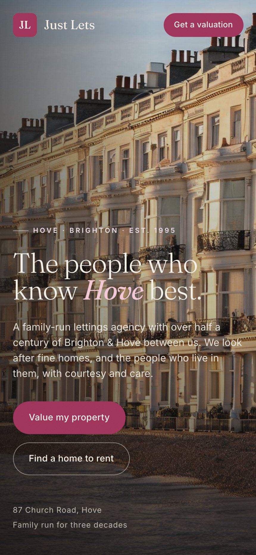
The advantage was the street itself, so the site opens on Hove seafront at golden hour with the line about knowing Hove best. Ivory, ink, and a deep rose lifted from the door of the office. It is one long page because a landlord deciding who to call does not want a navigation, they want to scroll once and feel that these people are careful.
What it does now
A site that looks more expensive than the national chains it sits against, with a valuation request built into the scroll rather than buried on a form page.
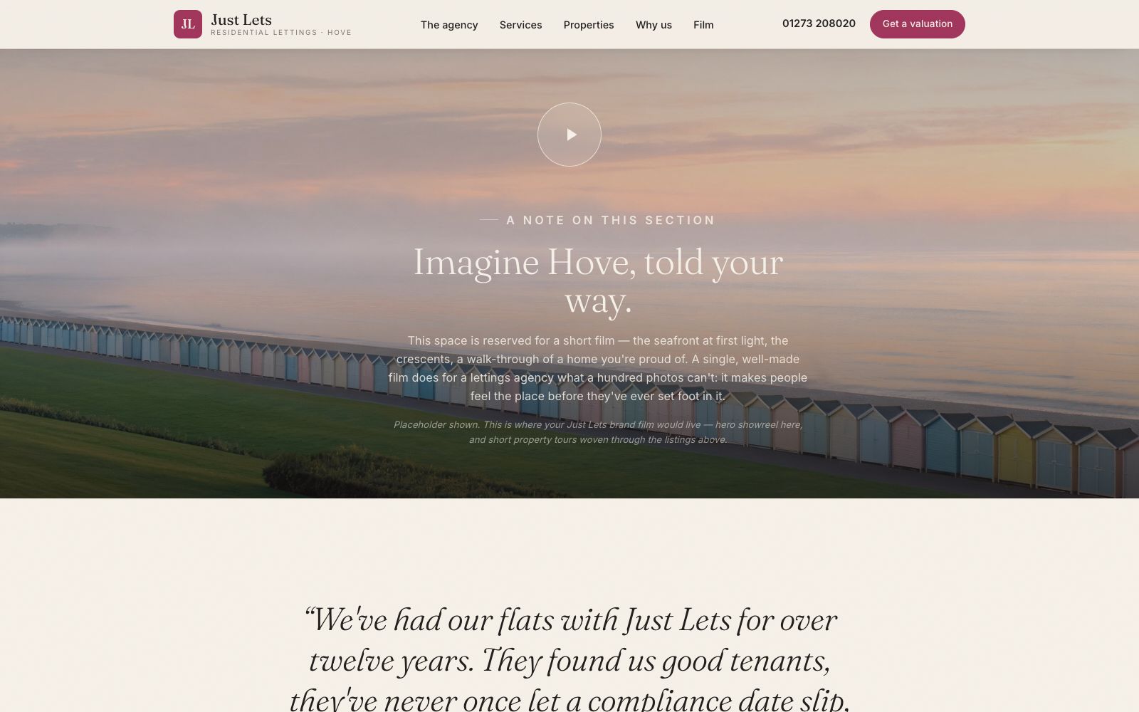
Every screen, as it really renders.
Captured from the live site at full width. Nothing here is a mockup or a flattering crop.
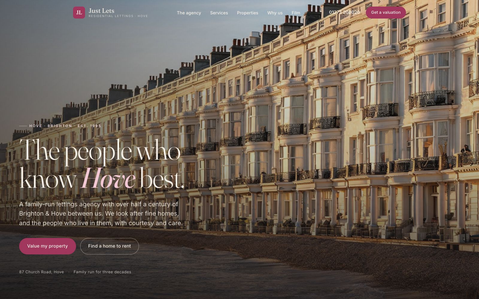
Home
Regency terraces at sunset, one italic word doing the positioning, and two clear routes for landlords and tenants.
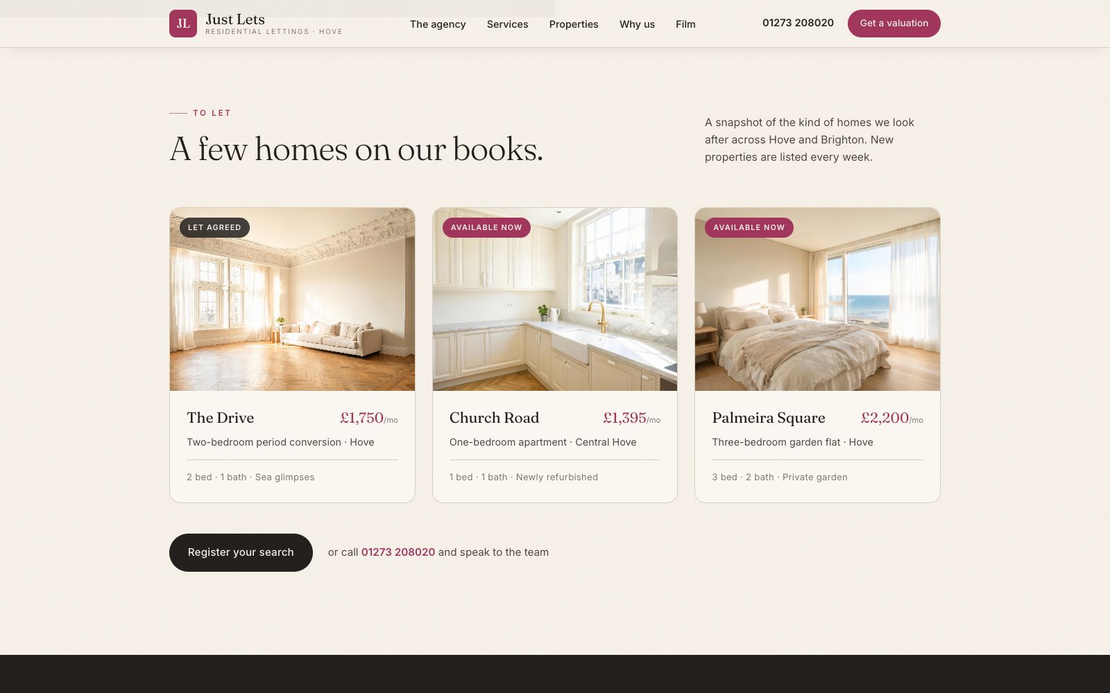
Properties
A short honest snapshot rather than a fake portal. Let agreed stays visible, which reads as busy rather than stale.
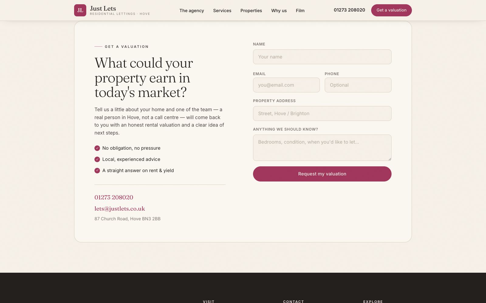
Valuation
A short wizard that asks the four things a valuer actually needs, then hands over.
Film
The videography section, because the agency shoots its own property films and that is a genuine point of difference.
On a phone
Most of the traffic to a site like this arrives on a phone, so the mobile layout is designed first and the desktop version follows it.
The same site at 430 pixels wide. Type resizes rather than shrinks, the navigation collapses into something you can reach with a thumb, and every image is served at a size that will actually load on mobile data.