Gosha Pilates
Mat and Reformer Pilates, Ringmer
Brand, Website design, Pricing tool, Copywriting
Wellness
Six
Next.js
Breath ring on scroll
What was wrong
Two teachers starting a studio in a village hall and a flint barn, with no brand, no site, and every competitor in the category using the same soft green wellness template.
How we read the brand
Everything in this category sounds the same, so the copy went first: strong enough for Tuesday, which is about ordinary life rather than transformation. The mark is a breath ring that expands and contracts as you scroll the page, which is the one owned interaction. Warm stone, a terracotta accent, and an italic display serif keep it closer to a good restaurant than a gym.
What it does now
A studio with a brand before it had a second location, and a pricing page that answers the cost question honestly rather than making people email to find out.
Every screen, as it really renders.
Captured from the live site at full width. Nothing here is a mockup or a flattering crop.
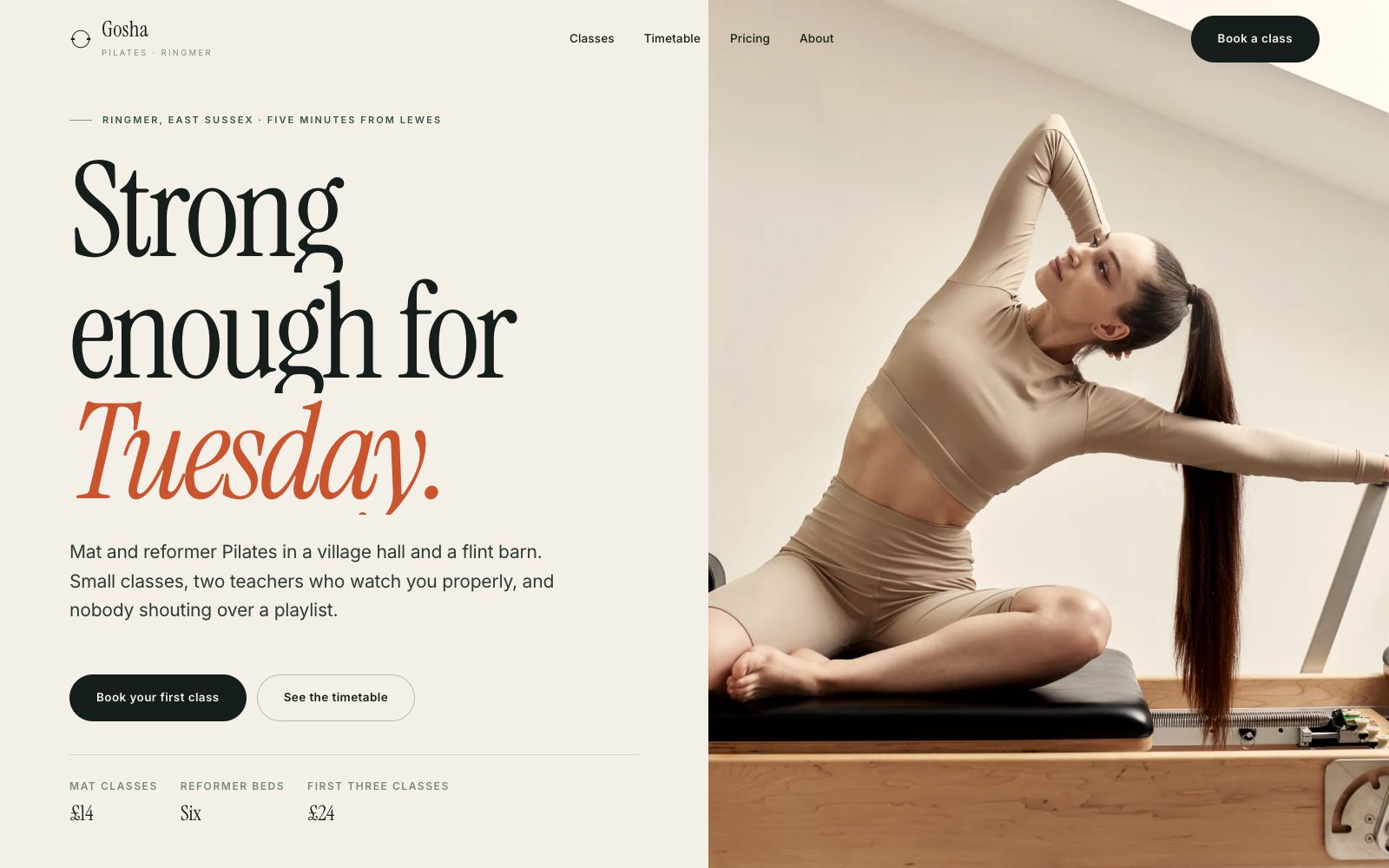
Home
One line of copy that does not sound like any other Pilates studio, next to a single well lit reformer.
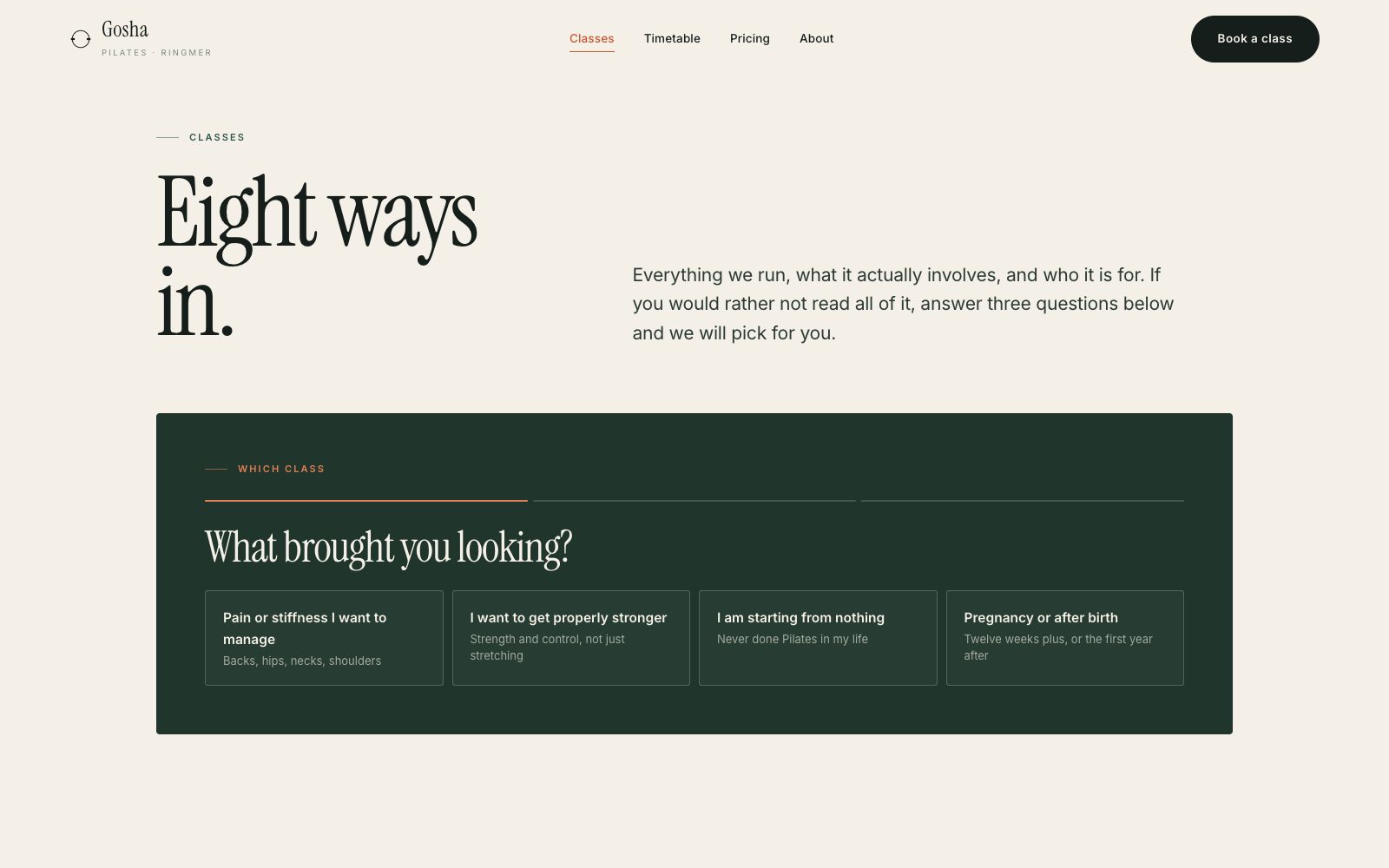
Classes
Mat and reformer explained for somebody who has never done either, without the jargon.
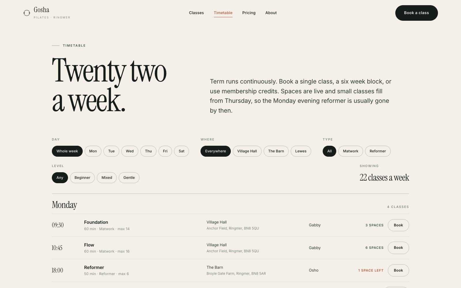
Timetable
The week as a grid, with class size shown, because small class size is the actual product.
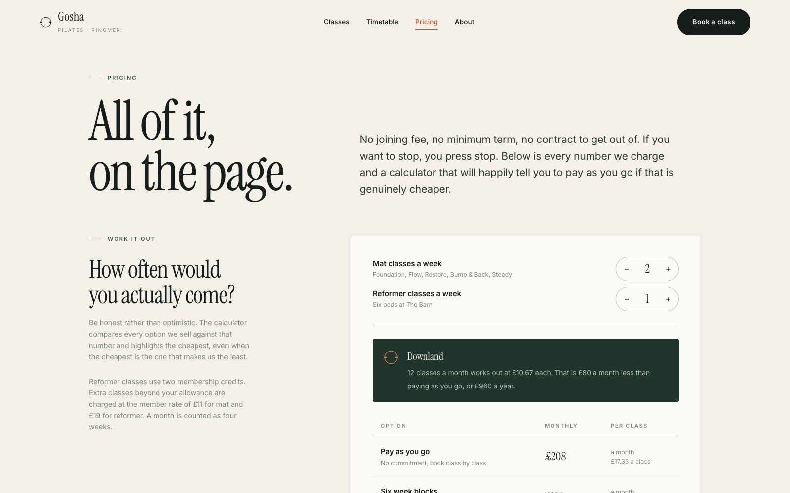
Pricing
Blocks, drop ins, and the first three classes, all priced on the page.
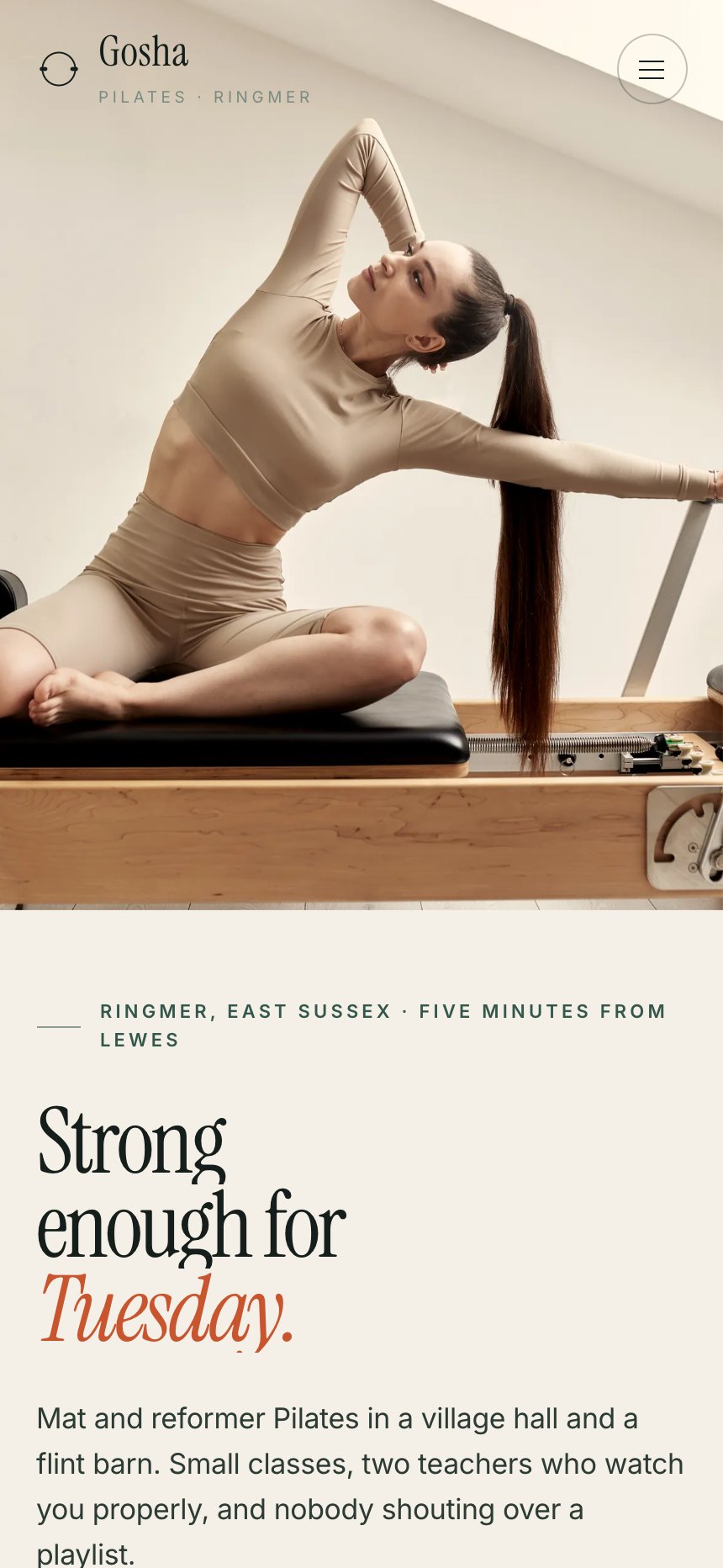
On a phone
Most of the traffic to a site like this arrives on a phone, so the mobile layout is designed first and the desktop version follows it.
The same site at 430 pixels wide. Type resizes rather than shrinks, the navigation collapses into something you can reach with a thumb, and every image is served at a size that will actually load on mobile data.